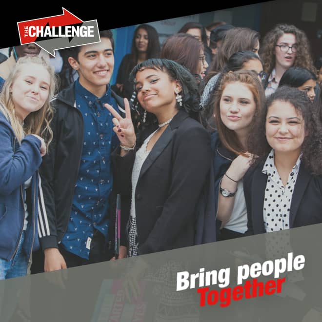
A digital revamp
What we did
- Strategy
- Digital Design
- Digital Development
- Content Management
- Web Development
Strategy
A user journey of a thousand miles...
We minimised the number of clicks needed to find content by identifying the essential user journeys and creating paths specifically for them, all backed by one intuitive, collapsible menu.

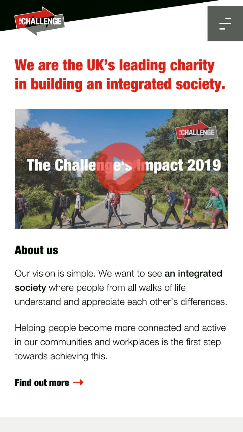
UI & UX
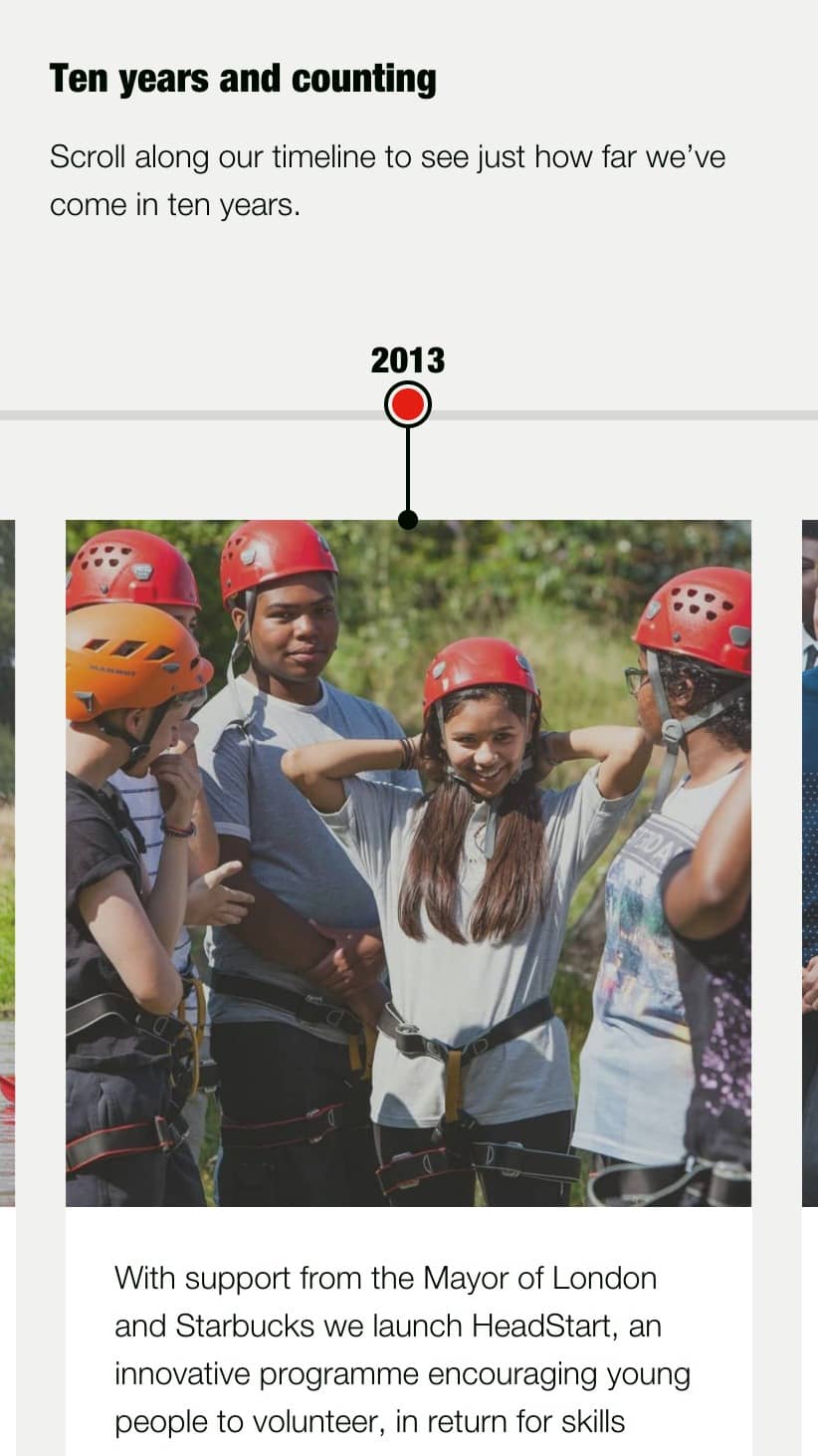
Overflowing with rich content
The Challenge had a big story to tell, naturally with lots of content. We organised pages into blocks and introduced side-scrolling for an experience of glancing down through a page quickly, and sliding sideways for the details.
Systems (Part 1)
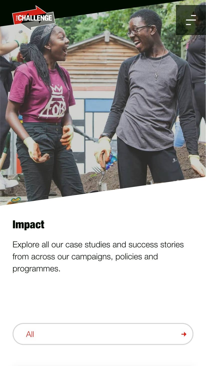
Easy content management
All site content needed to be easily managed across multiple teams, so we built systems to allow quick control of news articles, impact stories, policy reports, team profiles, career opportunities and microsites.
Systems (Part 2)
Headless content management
Microsites were created using a headless system to manage and serve content, allowing for full and versatile control of their external apps and pages.
One such page was On The Surface, an app launched by The Challenge for young people that takes them through an interactive social story.

Integrations
Consume all the API's
Along with an API for the Career Application Tracking System (ATS) and FAQs on the site, numerous landing pages were built to integrate with Google, Salesforce, SnapChat and Facebook.
