A modern brand
What we did
- Research
- Brand Strategy
- Brand Identity
- Logo Design
- Campaigns
- Iconography
- Illustrations
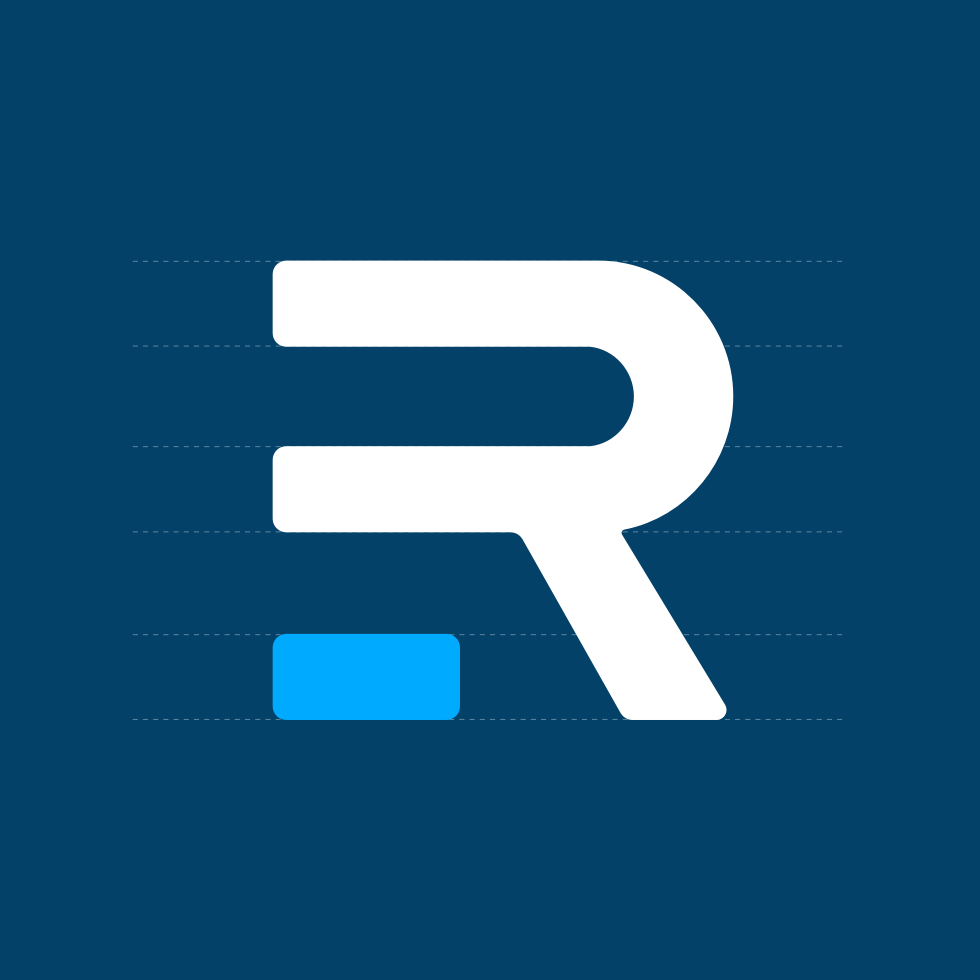
Brand
Unparalleled consistency
Rochen's straight-line and no-fuss brand flows beyond the logo and across all materials and marketing campaigns, supported by brand guidelines and toolkits.
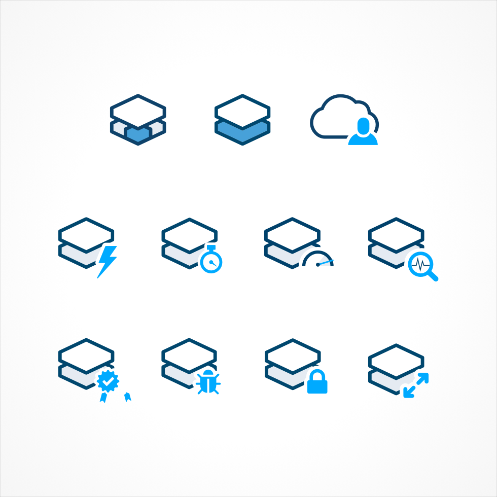
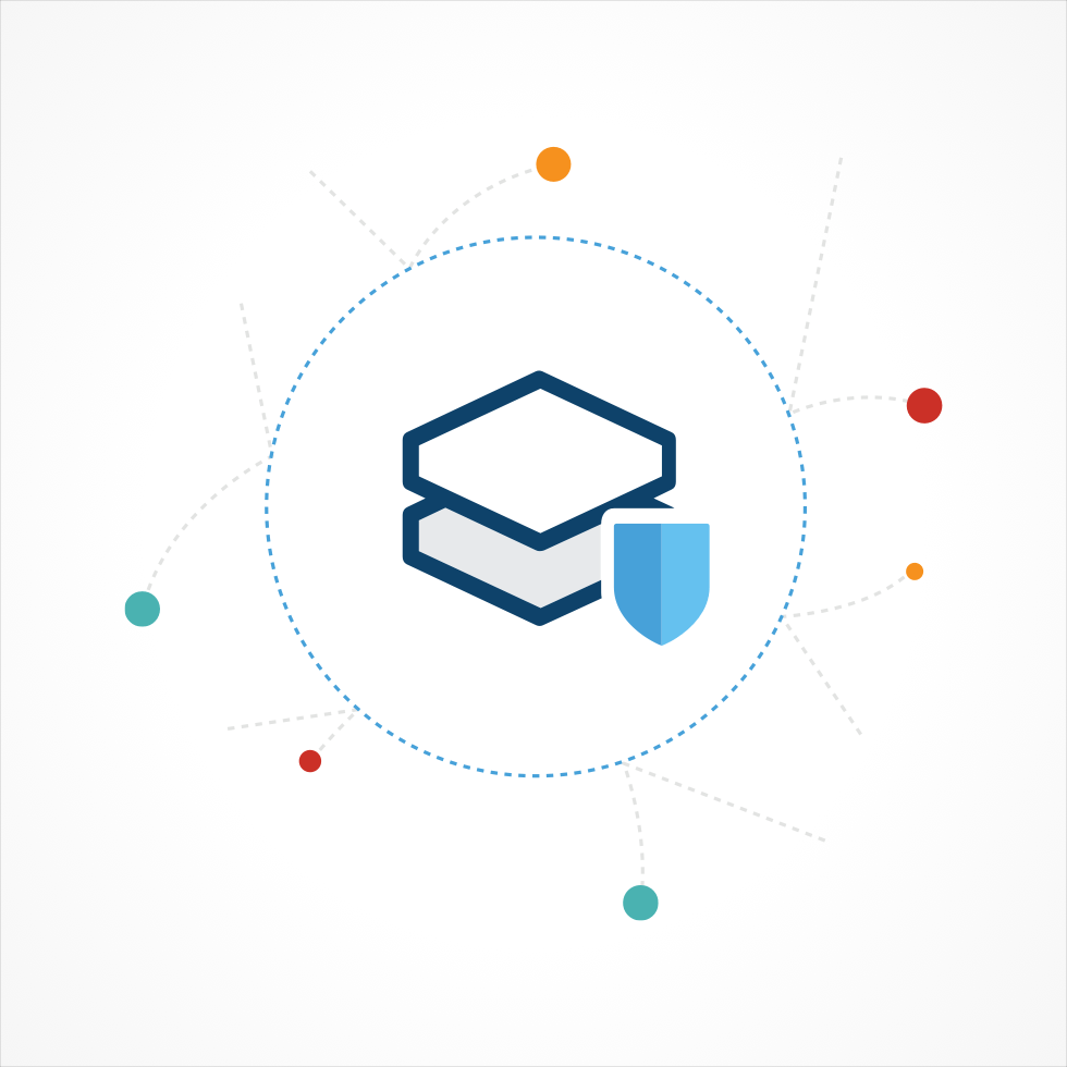
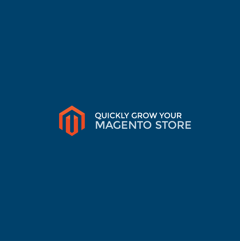
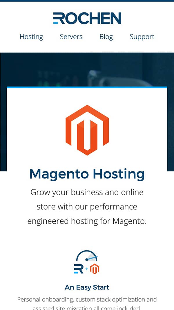
Icons & Illustrations
Brand resources
We designed a complete set of icons and illustrated artwork for use across marketing materials and onboarding documents.
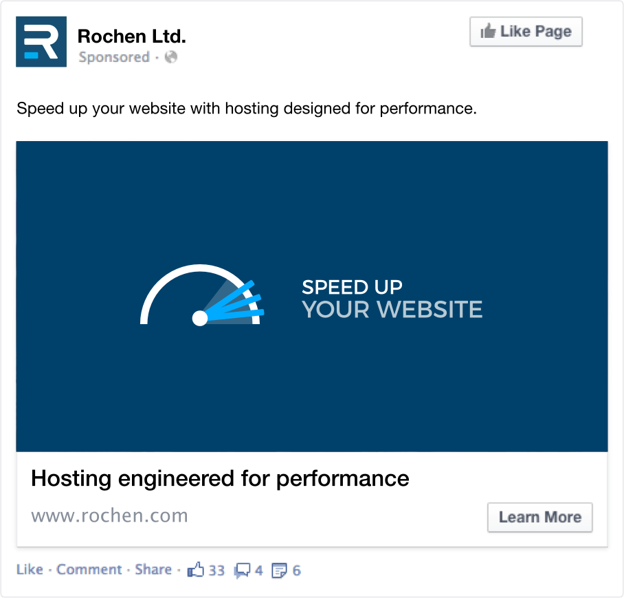
Campaign
An amplified launch
A series of advertising campaigns were launched across Seach and Social to support the launch of Rochen's new brand.
Results & Stats
Branded a success
Rochen saw a 30% increase in sales over the first year, along with a decreasing bounce rate of 60% - people staying on the site to learn more, and buying.

The team at zen quickly connected to our values and understood what we were about. Working through their creative process realised Rochen’s potention and delivered a brand that has stood up against our competition, at conferences and across the internet. We can’t shout about zen loudly enough.