A shiny website
What we did
- Brand Identity
- Brand Refinement
- Digital Design
- Digital Development
- Web Development
UI
Form and function
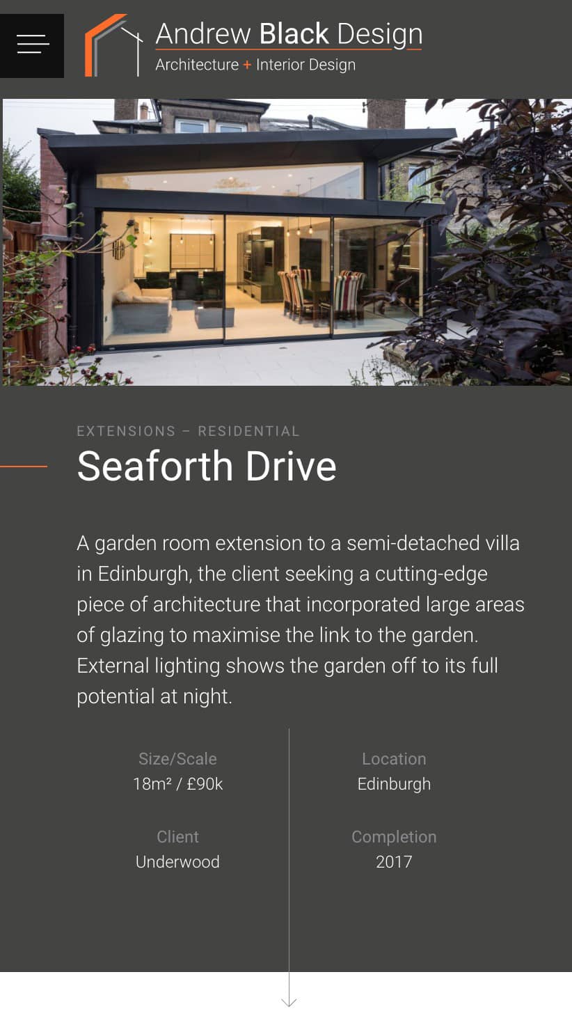
It was important that Andrew Black Design’s website worked seamlessly not only on mobile, tablets and desktops, but on bigger displays too, as it was intended to be used as a tool at pitches and presentations. A hidden function was engineered to scale up the site for these big screens and let their work stand out.


UX
Pixel-accurate and playful
Paying attention to the details, the pixel-thin line that was observed during our rebrand refinement was reflected throughout the design of the new site, embellishing headings, menus and in-page navigation.


Development
Foundations for the future
The audience was always expected to be on larger displays (currently 65+% on desktop!) but a full mobile-first approach was taken to ensure the website would be accessible and ready for every user.


The team at zen really got what we were trying to achieve with our rebrand and helped put the final touches to it. The collaboration between our team and theirs allowed us to create a website that we’re really proud of. We can’t recommend zen more highly.
