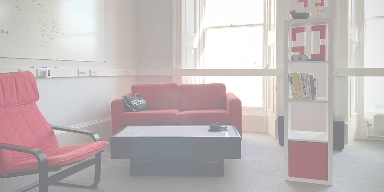
While our story started in 2006, the most significant chapter has only just begun. In the last half of 2019, we took the bold move to take on only one new project — our own. It's been quite the journey!

zenelements zen.
The name zenelements originated when Alex launched the company, almost fourteen years ago now. Yikes — we're a teenage company! While meticulously selecting 'zen', to inspire calmness and clarity for every project, 'elements' connected by chance during a walk to a book store one day. Alex stumbled across a sticker that read ELEMENT on the telescope of the statue of Adam Duncan in Dundee. With elements in code, the classical elements (earth, water, air and fire) and often referring to elements in a project - everything fell into place. And zenelements was born.
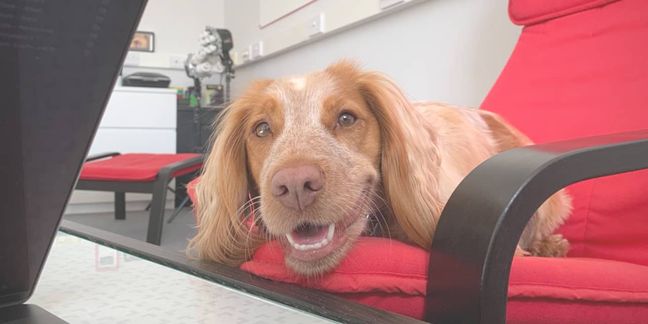
Fourteenth years on and a lot has changed — coding languages, big data, virtual reality, wearable technology. Our team (included the four-legged kind) has grown too! So we realised we needed to find a new way to live and breathe our brand.

After months of thinking, planning, doodling, writing and rethinking, we found at the core of everything we do one clear message:
"We work with brands that change the world."
Along with this bold new message, we felt it was time for a brave new name. And we didn't have to look far for it. Our clients already know us. They have been calling us this for you years, when we chat on the phone, ping a message or meet for a coffee. We're zen.
Boxy
Boxy has been in zen. since 2013 and represents our approach to always think inside and outside the box, and be forward-thinking. We gave Boxy an upgrade and calculated a lively new way for Boxy to connect around our brand. Boxy can 'behave' and sit alongside our logotype, be 'mischievous' and explode to mark the edge of a frame, or be 'sensitive' and cuddle up alongside key messages and slogans.

Colours
We enhanced our range of colours to bring more vibrancy to our brand, handpicking them to be more digitally-focussed.
Our new colours are:
- Black
- Red
- Green
- Blue
- Yellow

They display effectively in print and on-screen, on light and dark backgrounds. And, most importantly for us, they are refined to give a fully accessible colour palate.
Personality
In parallel with our new visual direction, we recognised we needed to start talking more bravely about ourselves too. So we rewrote our book!
We stand out from the crowd. We are breaking barriers. We know less is more! And everything we do is working towards making our world a better place.

Icons, Illustrations and Imagery
The last piece of our puzzle was to create a style of imagery that fitted our brand and complimented our bold new look and voice. We doodled and created our icons and illustrations with solid line art, coloured brightly in our green, with a touch of blue for personal features.
We further discovered our style of photography and videography, which will start to back up our illustrated imagery with the real aspects of our brand and business, from our team to our case studies and beyond.
So, what's next?
We have refocused and relaunched our brand for 2020. And better than that. We know who we are, what we're doing, and why we're doing it. We still deliver outstanding brands, campaigns and digital experiences, but all with our newfound focus - to make the world a better place. And we love it!
Connect with us and let's see if together we can help make the world a little better. We're up for it!